Microsoft’s new OS gives Windows 10 a much-needed facelift, tighter security, and a better overall experience.
More than six years after Microsoft launched Windows 10, Windows 11 is finally here. It’s been one of the longest waits between operating system versions in Microsoft history. Has it been worth the wait?
More important, when (and if) you’re offered the upgrade through Windows Update, should you take the leap?
I’ve put the operating system through its paces (with an eye to business use). Among the most significant changes I found are a smartly redesigned Start menu, tweaks to Search and Widgets, better integration with Teams (albeit for personal use, not business), enhanced security with TPM 2.0, and thoughtful fit and finish improvements throughout.
I’ll cover all that and more in this review, including when you might be able to upgrade — and if you can at all. I’ve also included a section near the end of the story detailing what IT needs to know about the new OS.
Read on for details about which new features are worth cheering about — and which miss the mark.
Slow rollout and strict hardware restrictions
First, some background about hardware requirements and rollout dates. In order to run Windows 11, you’ll need a PC that has a 1GHz or faster processor with two or more cores on a supported 64-bit processor or system on a chip (SoC). (Go here for a list of compatible processors). You’ll have to have 4GB or more of RAM and at least 64GB free on a hard disk or SSD. And you’ll also need Trusted Platform Module (TPM) version 2.0, which offers hardware-based security.
Most PCs sold in the last three or so years will likely be able to run Windows 11. But not all. I bought a laptop a year ago, and it can’t run the new OS, because it doesn’t have a compatible processor. You can check whether your machine makes the cut by downloading and running Microsoft’s PC Health Check app. (For details and other options, see “How to check if your PC can run Windows 11.”)
Even if your PC can run Windows 11, that doesn’t mean you can upgrade to it yet. Microsoft is taking a slow, phased approach to rollout. A Microsoft blog post says, “new eligible devices will be offered the upgrade first” but doesn’t detail what “new” means. It adds, “We expect all eligible devices to be offered the free upgrade to Windows 11 by mid-2022.” When you can upgrade, you’ll be notified via Windows Update.
Business users, of course, will be upgraded to Windows 11 only when their IT departments allow it. Microsoft is offering several tools to help administrators assess their Windows 11 readiness; see “What IT needs to know about Windows 11” for details.
Okay, that covers the basics. Let’s get down to details.
A new start for Start
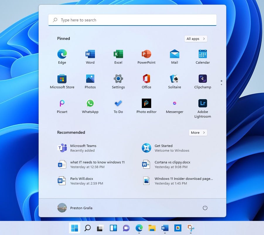
The most visible change in Windows 11 is front and center — literally. When you click the Start button, the Start menu launches to hover just above the bottom center of the screen, rather than being anchored to the left as it is in earlier versions of Windows.
It’s also been reduced in size, and you don’t scroll through it as you do through the Windows 10 Start menu. The large tiles that take up so much screen real estate on the Windows 10 Start menu have been replaced with smaller application icons. That means that live tiles, which could pipe in and display changing information, have been given the boot. In their place, as you’ll see later in this review, are widgets.
IDG
The menu has been stripped down in other ways as well. The Windows 10 Start three-column design is gone, replaced by a simple screen divided into two sections: pinned applications icons at the top and a “Recommended” section at the bottom composed of a mix of recent files you’ve opened and icons for apps you’ve recently installed.
This less-is-more approach works admirably. The compact design lets you quickly find the apps you want to run, because more of them are visible in a less-cluttered interface. You get more choices and also a clearer view of what’s available. If you don’t immediately see the app you want to run, click the All apps button at the upper right to get to a scrollable alphabetical list of every app on your PC, or use the search bar at the top of the menu (more on that in a moment).
You can easily unpin an app from the Start menu — right-click it and select Unpin from Start. To pin an app to the menu, click All apps, scroll to one you want to pin, right-click it and select Pin to Start.
The Recommended section is also useful. The files you’ve most recently opened are right there in front of you, so it’s much easier to get back to work you’ve recently done. To look for more of them, click the More button, and you get a long, easy-to-scroll list. You can unpin a file from Recommended by right-clicking it and selecting Unpin from Start. However, you can’t pin a new file to it.
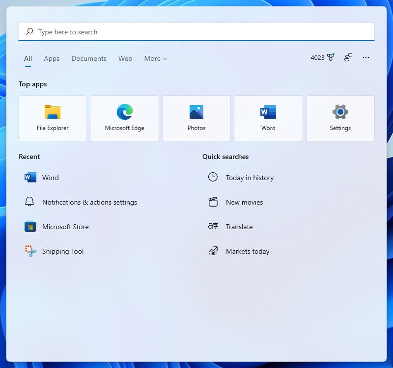
Search is integrated directly into Start via a text box across the top of the screen. But you may find yourself disconcerted when you click it, because doing that doesn’t place a cursor in the text box and let you start searching. Instead, a search screen pops up, the same one you’ll see when you click the Search icon on the taskbar. It takes some getting used to.
You can also manage your user account from Start by clicking your account icon at the bottom left of the screen. And you have access to actions such as putting your PC to sleep, shutting it down, and restarting it by clicking the power button at the bottom right.
Only after I worked with Windows 11 for a while did I realize just how cluttered the Windows 10 Start menu was, and a result, how little I used it. The new Start menu is not just more aesthetically pleasing, but I found myself using it more than the old Windows 10 Start menu. Most useful for me is the Recommended section. To open a file I’ve recently used, I don’t have to hunt through File Explorer or launch an application, then browse for the file. Instead, I just click a file right in front of me. It’s a considerable time-saver and productivity booster.
In short, the new Start menu is a winner and the thing I like most about Windows 11.
A slightly tweaked Search
Search has gotten a once-over-lightly redesign, but not much has really changed. When you click its icon, Search, like Start, pops up in the center of screen just above the taskbar. The softer, rounded feel of Windows 11 is used to good effect here, and Search is more pleasing to the eye. It’s more compact than Windows 10 Search as well. Because it uses smaller icons than does Windows 10 search, it’s able to fit more into less space, offering four “quick search” icons compared to Windows 10’s three.
IDG
The basic layout stays the same, however, and I found no difference in Search results in Windows 11 search compared to Windows 10.
One change is fairly useless: When you hover your mouse over the Search icon on the taskbar, it displays the last three searches you did that resulted in you clicking on something in Windows 11, such as an app or a setting screen. Those three searches are the same as the first three that are displayed on the lower-left of the Search screen itself. (Note that Windows 10 also displays that type of search results on the lower left of its screen.) If Microsoft wanted to make this hover feature useful, it would display your most recent three searches, not just those that result in you clicking on a Windows app or setting.
I found one other change slightly distracting: When you click on any of the categories in the horizontal row towards the top of the screen (Documents, Web, etc.) to narrow your search, Windows 11 automatically appends matching text to the beginning of your search, for example, “apps:” when you click Apps. Windows 10 Search doesn’t append text in that way when you narrow your search. It’s not at all clear why Microsoft made this unnecessary change.
Snap Layouts and Snap Groups
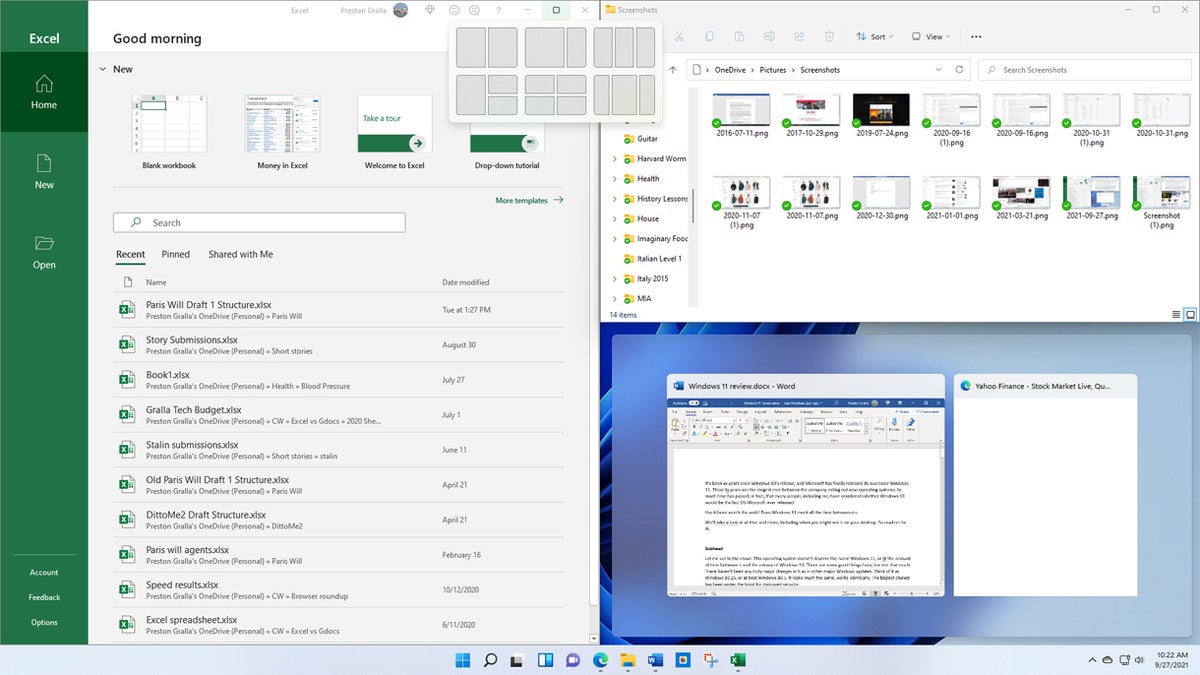
Microsoft introduced a pair of features it hoped would offer a productivity boost — Snap Layouts and Snap Groups — but I found them to be a mixed bag at best. With Snap Layouts, you can group your open windows into one of a half-dozen pre-built screen layouts, such as having two apps side by side, each taking up half the screen. Or you might have one app on the left and two stacked vertically on the right, or four apps in a grid. The idea is that you’ll be able to find the perfect layout for you, one that fits the way you work.
To use Snap Layouts, first open the applications you want to be in it, then hover your mouse over an application’s maximize icon on the upper right of the screen, located between the minimize and close icons. Choose the layout you want and which position you want the application to be in, and the app window snaps into that position. Then you can choose from your other open apps to fill in the rest of the spots in the layout.
IDG
Once all the places in a Snap Layout are filled, that app grouping is saved as a Snap Group that you can quickly return to later if you’ve opened other apps or minimized any of the app windows in the group. Hover your mouse over the taskbar icon of any of the applications in a Snap Group, and you’ll see two small popups — one that’s a thumbnail of what’s open in the application itself, and another that shows the Snap Group. Choose the Snap Group icon and you switch to the whole group in the layout you set up previously, rather than to the individual application.
All this sounds fine in theory, but in practice I found it more annoying than useful, and confusing to use. It took me a while to figure out how to choose which application should go into what part of an individual Snap Layout, and I only discovered how to use the Snap Group feature after a good deal of clicking around.
More important, I found that arranging applications in a Snap Layout was of no use to me whatsoever. As they say, your mileage may vary, but for me these features were a big letdown.
The Widgets sideshow
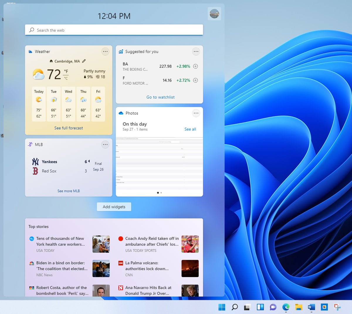
Windows 10 included a number of widgets such as a news feed, weather, and more. Although you could run them individually, they never really had a home of their own. In Windows 11, that’s changed. Click the Widgets icon on the taskbar (it’s a square divided vertically into two sections, one white and one blue), and a large panel appears on the left side of the screen showing a preselected set of them, including weather, news, sports, and others.
Each displays changing information; click one and you’re typically sent out to the web to get even more details. You can change the size of each widget, remove it, and customize it by clicking the three-dot menu icon at its upper right.
IDG
Click the Add widgets button, and you’ll see a selection of even more you can choose from, such as one for checking traffic, a to-do list, Windows tips, entertainment, and several others.
I found widgets to be moderately useful for when I wanted a quick news hit or to find out about the weather. I would have liked a wider selection of them. I also would have liked to be able to resize the widget pane to make it smaller, and to keep it onscreen all the time, so I didn’t have to constantly click the taskbar Widgets icon to see them.
Teams integration
The Covid-19 pandemic changed the way we work and live, with videoconferencing and chat increasing as in-person meetings decreased. With Windows 11, Microsoft is betting that chat and video meetings will remain an important part of people’s work and private life, even when life becomes more normal.
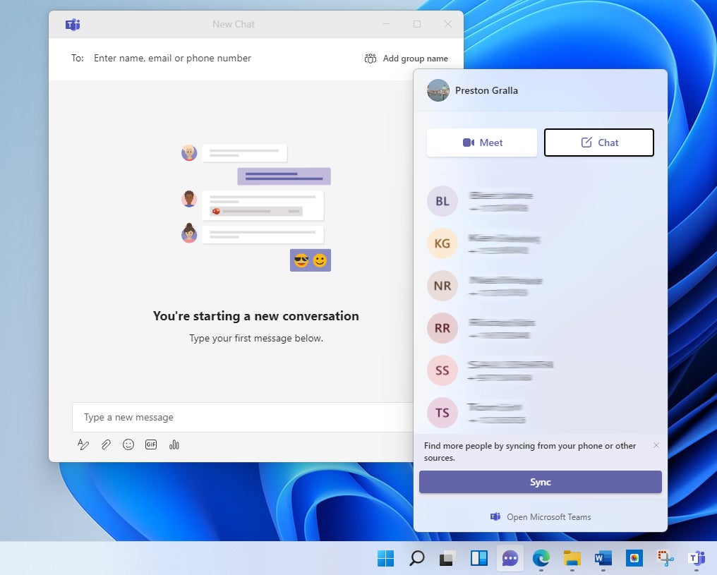
So its Chat with Microsoft Teams feature puts an icon front and center on the taskbar for its Teams collaboration, chat, and videoconferencing software. Click the icon, and a Teams screen opens up with your contacts on them. (Note that the icon looks like a video camera until you click it. At that point, it turns into a conversation bubble icon.) You can scroll and search through it.
IDG
When you find someone with whom you want to connect, click that person, and a Teams chat and videoconferencing window opens, requesting to connect. (You can also use the Windows key + C keyboard shortcut.) At that point, you use Teams as you would normally.
If the person to whom you want to connect doesn’t use Teams, they will get an SMS message, and you can chat that way.
Note that this Teams integration is targeted for personal use, not business use, so the full suite of enterprise Teams features, such the use of channels, being able to search through message archives, and so on, isn’t available. I expect that over time, business and enterprise versions of Teams will become part of the Windows 11 integration.
Fit and finish improvements
The overall look of Windows 11 has changed subtly from Windows 10, with rounded windows, spiffier animations, and an overall softer feel. What Microsoft calls the “materials” on the surfaces of screens have been updated as well. For example, its semitransparent Acrylic effect, which in Microsoft’s words “replicates the effect of frosted glass,” has been made brighter and more translucent. You’ll find Acrylic on flyouts and context menus. (See Microsoft’s information page, “Materials in Windows 11,” for more details about Acrylic and other materials.)
Many other small changes have been made throughout the operating system. One particularly noticeable Mac-like one is that when you maximize or minimize a window, its icon the taskbar bounces just a bit.
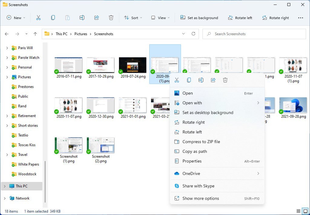
File Explorer represents a perfect example of what’s been done in many parts of Windows 11, with rounded windows, a softer background, and a bright new set of icons. Its Ribbon has been overhauled and simplified so it has only one tab, and the most useful actions are represented by icons, within easy reach so you don’t have to hunt and peck through different tabs. Even the right-click menu has been stripped down and simplified, and each menu item has an icon next to it, so it’s easier to differentiate among your choices.
IDG
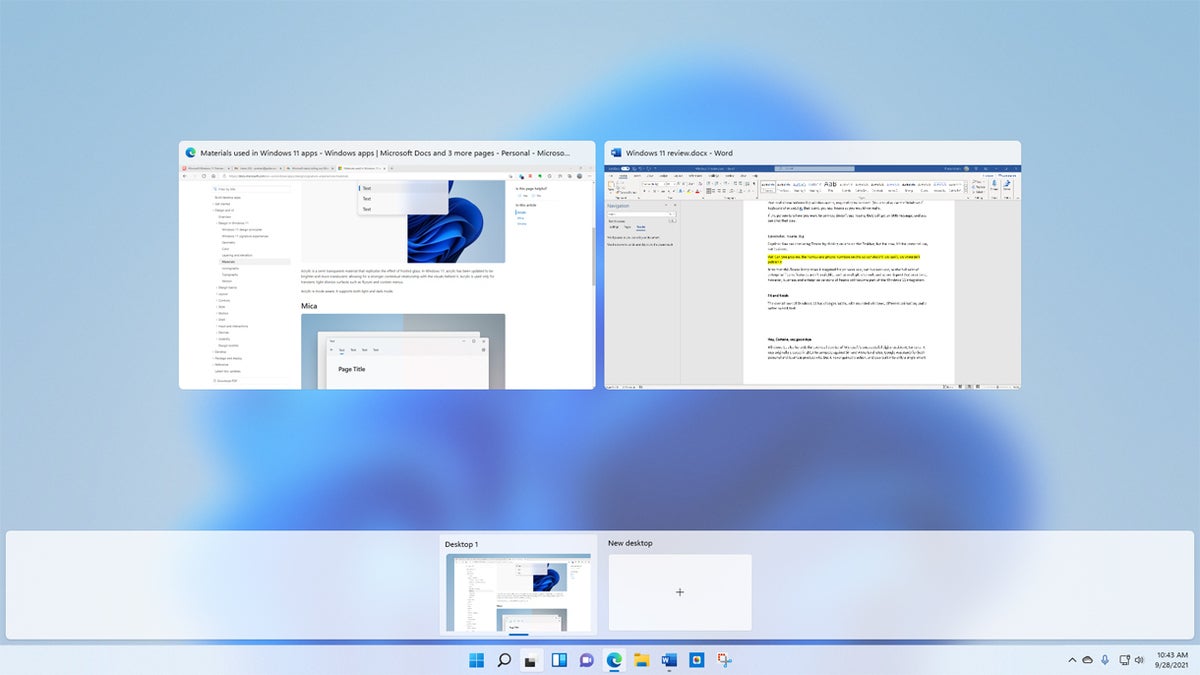
The virtual desktops feature (called Task View in Windows 10) has also gotten an overhaul. Hover your mouse over its icon on the taskbar (two overlapping windows, one white, one black), and you’ll see icons representing all your existing virtual desktops so you can switch to any of them, as well as a button for creating a new one. Click the taskbar icon instead of hovering, and you’ll see thumbnails of each of your desktops. Click any to go to it or click the + button to create a new one.
IDG
The result: virtual desktops are now easier to create and use, and the interface is more visually appealing.
Will all these interface changes make a difference in your productivity? Maybe so, maybe not. But the new interface does feel easier on the eyes, and if you spend a lot of time in front of your computer, that’s a good thing.
Hey, Cortana, where’d you go?
Windows 11 disses Microsoft’s unsuccessful digital assistant, Cortana — by default it’s not enabled, although you can turn it on if you’d like. Cortana was launched in 2015 to compete against Siri and Alexa (and later, Google Assistant) for both personal and business productivity. But it never gained traction, and outside of Windows 10, it was built into only a single smart speaker, which sold poorly. Microsoft continually cut back on its capabilities over the years, eventually removing its consumer features such as playing music and controlling smart home devices.
Cortana will go down in history as one of Microsoft’s biggest failures. It failed at the most basic of jobs. During the worst of the Covid pandemic, a Computerworld investigation found that Cortana wouldn’t answer the simplest questions about Covid safety, such as whether masks and vaccines help stop the spread of Covid, and wouldn’t dispute bizarre Covid conspiracy theories. After the Computerworld article came out, Cortana did begin to offer some correct Covid information, but it still omits some vital Covid info. As I was writing this review, I asked Cortana, “Does the covid vaccine implant a microchip in you?” Cortana answered: “Sorry I don’t know the answer to this one.” (For the record, it doesn’t.)
It’s not clear why Microsoft left Cortana in Windows 11 but turned it off by default. It’s certainly an indication, though, that Microsoft no longer sees it as competition for Siri, Alexa, and Google Assistant. It will remain in Windows, at least for now, but its demotion in Windows 11 heralds the digital assistant’s eventual demise.
If you do find Cortana useful and want to enable it in Windows 11, go to Settings > Apps > Apps & Features, then scroll to the Cortana entry. Click its three-dot icon, then select Advanced options. On the screen that appears, in the “Runs at log-in” setting, move the slider from Off to On. The next time you log into Windows, Cortana will start. To run it, do a search for Cortana and then click its icon.
I have yet to find a way to make Cortana’s icon appear on the taskbar. When you go to the taskbar settings that let you control what icons should appear on it, Cortana doesn’t show up as an option, even if it’s enabled to run at startup.
What else is new?
One of Windows 11’s most anticipated features is the ability to run Android apps, but that capability is missing in action at launch. The company hasn’t yet said when it will make its appearance.
That said, there are several smaller or less visible enhancements in Windows 11. Most notably:
Under the hood, TPM 2.0 works to protect you against cyberthreats. See “What IT needs to know” for more details.
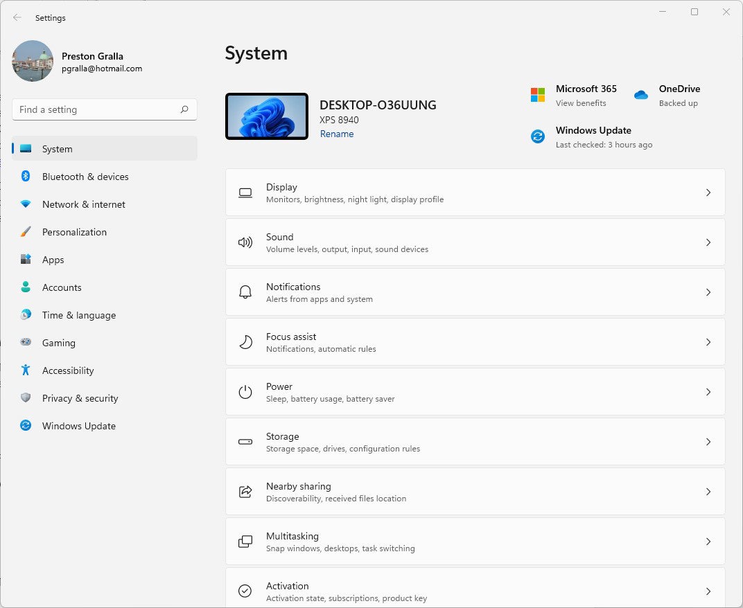
The Settings app has been redesigned and reorganized. Rather than having to click on icons that represent different categories, you now see a list of categories; an arrow to the right of each category brings you to the options that are available. In some instances, new settings have been added. It’s a bit simpler to use than in Windows 10, but even an inveterate tinkerer like me found little new of interest.
IDG
The Action Center is gone, replaced by separate Notifications and Quick Settings panels. Quick Settings is more compact and shows more settings at once than its Windows 10 predecessor. To get to it, click the Wi-Fi, speaker, or battery icon at the far right of the taskbar. For Notifications, click the time and date at the far right of the taskbar, which will show a number that indicates how many notifications you have.
IDG
What IT needs to know about Windows 11
The most important aspect of Windows 11 for IT isn’t visible — it’s under the hood. The operating system requires hardware with a TPM (Trusted Platform Module) 2.0 built into it for security. TPM uses hardware-based encryption to encrypt disks using Windows capabilities like BitLocker and can stop dictionary attacks against passwords, among other capabilities. (See Microsoft’s “How Windows uses the Trusted Platform Module” document for more info.)
Given that enterprises are under constant, increasingly sophisticated attacks and that ransomware is an ever-present threat, this is a big deal for IT — so big a deal that all other Windows 11 capabilities pale in comparison to its importance for IT.
IT will also welcome Windows 11’s once-a-year feature update schedule rather than the two-a-year cycle under Windows 10. That will reduce udpate time, effort, and headaches. Businesses can use existing Microsoft enterprise management tools, including Microsoft Endpoint Manager, Windows Update for Business, and Autopilot, for Windows 11 deployment and management. No new tools have been released for Windows 11.
To help make sure enterprise applications and other software can run on Windows 11, Microsoft has released Test Base for Microsoft 365, an automated testing tool to check application compatibility. If there are compatibility problems, Microsoft says companies can use its existing App Assure service that helps companies with 150 or more users to troubleshoot and fix app issues.
The upshot
Was it worth the wait for Windows 11? What does it all add up to?
Keep this in mind: The two other times Microsoft took five years or more to update to new versions of Windows, the changes were tremendous, with the newer version almost feeling like an entirely new operating system. The first time was between Windows 3.0 in 1990 and Windows 95 in 1995. The second was between Windows XP (released in 2001) and Windows Vista (released in 2007).
This time around, there haven’t been nearly as many changes as in those previous overhauls. If truth were required in branding, Microsoft would call this new version Windows 10.5 (or even 10.25), not Windows 11. The new Start menu is useful but not revolutionary, and that’s the most noticeable interface change. A number of other changes are good ones as well, but to a great extent they’re around the edges and don’t significantly alter anything basic or important about the way Windows works.
And that’s not a bad thing. Windows 10 on the whole is a solid operating system, and Windows 11 improves on it. Throughout Windows’ nearly 40-year history, major updates have generally been crapshoots, with some massive stinkers (I’m looking at you, Windows Vista and Windows 8) and some very good ones (nice job, XP… and you too, Windows 10). It’s better to take the right small steps than the wrong big one.
So whether this update should be called Windows 11 or Windows 10.5 is beside the point. It’s a solid improvement on Windows 10, with better security, a better interface, and a better overall experience. And we should be thankful for that.
So when the update comes your way, it’s well worth it to upgrade — and after all, free is free. That said, it never hurts to wait several months after an upgrade becomes available to adopt it, just to make sure any kinks get ironed out first.
If your hardware doesn’t support Windows 11, there’s no need to rush out and buy a new PC now unless you want to get the added hardware-based security or if you’re feeling bored with the way Windows 10 looks and would like something easier on the eyes. Microsoft has promised to support Windows 10 until October 2025, so your current Windows 10 PC will continue to receive bug fixes and security updates for years to come.
Businesses, of course, have other things to keep in mind when upgrading. Even if their hardware supports the new OS, they’ll likely wait longer than consumers to upgrade because they need to be more conservative when making big changes. But just the increased security and the once-a-year rather than twice-a-year feature updates will (eventually) make the update worthwhile for them.
This article originally appeared on ComputerWorld.

